

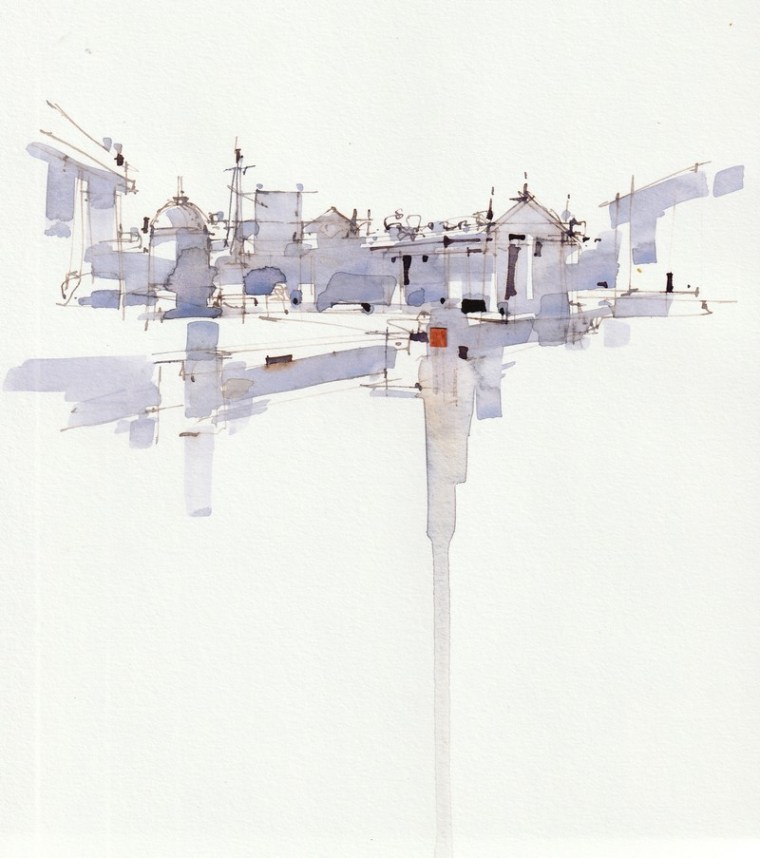
“Guilty pleasures”, one of a series of sketches in Amsterdam. I often finish them in my studio, but try to keep the random overall impression as much as possible. The methods to stimulate your creativity… More
Magic of suggestion
…….I prefer to make such a quick sketch from the wrist. Combined with the magic of suggestion, guessing the true meaning, is for me the pinnacle of freedom in drawing and painting. Here reality and abstraction enter into a wonderful union………….What is that “reality”actually? According to Heraclites a moving process – panta rhei- like a kaleidocope. Socrates also made an attempt with his allegory of the Cave, which was recorded by Plato in his “Republic”. In short, every individual experiences the world differently, because of his genes, upbringing and experiences. Nature and nurture. Hence the differences in taste. One admires Rodin, the other is crazy about the garden gnome……………. Read at a chalet in Switzerland: Einer acht’s, der Ander veracht’s, was macht’s

Wise lessons and other nonsense
Do you know them? Those instructors who tell you exactly how to paint? To wit: their way. Their work may show a personal (but limited) vision that works for them, but that may be totally unsuitable for you. Even so, you start working in the style of your great role model for a while, but it turns out not to be what you were looking for. The lesson: never accept anyone’s teaching unquestioningly, no matter how big a name he is. Only accept his teachings after filtering them critically through your own thought frame.

Personally, I’ve always disliked rules in art. A guideline, a choice among several options for reaching a solution offers you more room to develop your own creativity. Following the rules too rigidly makes for work that is just as uninspired as a slapdash effort.
Distinguish between “knowing thát” and “knowing how”. You don’t learn to paint by memorizing rules, but by doing.
A good teacher doesn’t teach you whát to think, but thát you have to think.
A good instructor teaches you to make your own choices so you become more aware of your actions. You learn to be your own critic. You learn to distinguish between possibilities that may be qualitatively equal, but one solution appeals to you a little more than the other. Now you know why.
Everyone has a unique view of the world. That view determines your personal perspective on art.
Try to step out of your comfort zone and experiment a little more. You’ll make work that is really yours, without being overly influenced by those “great role models”.
Here’s an example. You’ve already made a few preliminary sketches of your subject, considerably reducing the degree of realism. Which sketch is your favorite? Use it as the starting point for your final pencil sketch on watercolor paper.
Next up is the experimental stage. Apply some loose, spontaneous color notes to your composition, some horizontally, others vertically and diagonally, partially covering the main motif so as not to isolate it. Leave some areas in and around the main motif unpainted to allow for more contrast in the next phase. Your chosen color palette should contain a warm and a cool color. It’s perfectly okay to let them mingle here and there.

This will result in a coherent color pattern with an average tonal value. What’s missing at this point? You need a focal point with more contrast and a figurative element to suggest a recognizable subject. This working out of the figurative element is different for everyone. One painter may merely suggest it, whereas another may want a higher degree of realism to hold on to. Still, the underlying free, abstract color pattern ensures a result that looks loose and spontaneous. It’s the contrast between accurate elements and loose, spontaneous ones that makes a work look fresh and attractive.
I’ve used a combination of phthalo blue and raw sienna in the sketches. The accents were done in brown bister with a bit of collage in a contrasting color. You can look at these sketches as ideas and starting points for your own efforts.
But again, only accept this method if you find that it works for you. Otherwise, continue painting in familiar ways that you enjoy. There’s nothing wrong with that.
Comments or questions? I’ll be happy to answer them.
Kees van Aalst
info@keesvanaalst.nl
Wijze lessen en andere onzin
Ken je ze ook? Docenten die je haarfijn uitleggen hoe je moet schilderen? Namelijk op hun manier. Hun werk straalt wel een persoonlijke maar beperkte visie uit, die voor hen goed uitpakt, misschien voor jou totaal ongeschikt kan zijn. Je gaat zelfs een tijdlang werken in de trant van je grote voorbeeld. Het blijkt toch weer niet wat je zoekt. De les? Neem nooit voetstoots iets van iemand aan, al heeft hij nog zo’n grote naam. Accepteer het pas nadat het eerst door je eigen kritische denkraam is gefilterd.
Ikzelf heb altijd een afkeer van regels in de kunst gehad. Een leidraad, een keuze uit meer mogelijkheden om tot een oplossing te komen geeft je meer ruimte je eigen creativiteit te ontwikkelen. Te star vasthouden aan voorschriften geeft net zo’n ongeïnspireerd resultaat als er met de pet naar gooien.
Onderscheid “weten dát” en “weten hoe”. Schilderen leer je niet door regeltjes uit je hoofd te leren maar door het te doen.
Een goed docent leert je niet wát je moet denken, maar dát je moet denken.
Een goed docent leert je zelf keuzes maken waardoor je bewuster van je handelen wordt. Je leert zo je eigen criticus te zijn. Je leert onderscheid maken tussen mogelijkheden die kwalitatief misschien gelijkwaardig zijn maar die ene oplossing spreekt jou net wat meer aan dan de andere en je weet nu ook waarom.
Ieder is uniek en kijkt anders naar de wereld. Die kijk bepaalt jouw persoonlijke visie op kunst. Probeer dus eens uit je comfortzone te komen en ga meer experimenteren. Je maakt dan werk dat echt van jezelf is zonder teveel invloed van die “grote voorbeelden”.
Een voorbeeld. Je hebt al enkele voorschetsjes van je onderwerp gemaakt, waarin de werkelijkheid drastisch is gereduceerd. Welke schets heeft je voorkeur? Gebruik die als uitgangspunt voor je definitieve potloodschets op aquarelpapier.
Nu komt de experimentele fase. Breng op een spontane manier wat losse kleurtoetsen aan, zowel horizontaal, vertikaal als diagonaal, ook deels over het hoofdmotief in de schets om dit niet te isoleren. Laat in en om dat hoofdmotief delen onbeschilderd voor meer contrastwerking in de volgende fase. Je zelfgekozen kleurpalet moet een warme en een koele kleur bevatten. Als de kleuren zich hier en daar mengen is geen enkel bezwaar.
Het resultaat is een samenhangend kleurpatroon in een gemiddelde toonwaarde. Wat ontbreekt er nog? Een aandachtspunt met meer tooncontrast, waarbij een figuratief element als handvat de herkenbaarheid van het onderwerp suggereert. Deze figuratieve uitwerking is voor ieder verschillend. De één zal het zo suggestief mogelijk houden, de ander zal voor iets meer figuratie kiezen als houvast. Maar het vrije, onderliggende, abstracte kleurpatroon zorgt voor een spontaan en los ogend resultaat. Juist het contrast tussen accurate en losse, spontane elementen zorgt voor fris, aantrekkelijk werk.
In de schetsjes heb ik een combinatie van phtaloblauw en rauwe siena toegepast. De accenten in bruine bister met een collage in een contrasterende kleur. Zie deze schetsjes maar als ideeën, als uitgangspunt voor je eigen pogingen.
Maar nogmaals, accepteer deze methode alleen, als je ervaart, dat ie voor jou werkt, ga anders gerust door op de manier die je gewend bent en waar je plezier aan beleeft. Daar is niks mis mee.
Reacties en vragen? Ik beantwoord ze graag.
Kees van Aalst
info@keesvanaalst.nl
Zen and the Art of Seeing (2)
What we see isn’t what we see, but who we are.
A painting is a filtered, subjective version of reality. That reality is different for everyone. What one person considers beautiful, another passes by indifferently.
Beauty isn’t located in the objects we perceive, but in our own way of regarding things. You can discover exquisite beauty in even the most modest things.
Although I didn’t really intend to give technical advice in these essays, I do have a few tips, should you want to put something down on paper. You’ve probably heard them before, from me or from others, so just regard them as a reminder. Please don’t consider them rules – which get in the way of your creativity – but think of them as ideas you might use to your advantage.
Failing to plan is planning to fail.
Always make a few preliminary value sketches using a soft pencil – 4B or 6B – using three values: light, middle, and dark; nuanced, yet still distinct. Particularly, be sure to establish a coherent value pattern, with a very few details at most. Don’t hesitate to bend reality a little. A painting has different demands than a photographic rendition. Investigate several different compositional possibilities in these sketches. Sketch like a composer: make it recognizable, but definitely not a literal depiction of reality.
When you choose your strongest, most powerful pencil sketch as the basis for your painting, it guarantees an 80% successful painting beforehand.
Don’t put it in jail.
Group your subject in about five large shapes, using soft edges to blend many shapes together. This gives them air and lets them breathe. “Don’t put them in jail.” This way, the subject as such disappears, to become part of a larger whole. You avoid having a bunch of disjointed small shapes when you join them into a smaller number of abstract forms. Similar tones or hues are proven ways to glue them together, and turn a messy, chaotic image into a harmonious whole.
!!!
Place the most prominent details along the edges of those forms as much as possible, so they don’t act as separate elements causing restlessness in the composition. This way you don’t give more attention to the details than necessary, while enlivening the edges of the larger shapes.
!!!
Don’t be afraid to keep large parts of the work quiet, in contrast with the more active and detailed part at the focal point. An additional advantage of this is that those quieter parts require less painting, hence there is less risk of making mistakes. Do make sure to enliven those quiet parts somewhat by using value or color gradation, or applying some spattering.
I’ve kept my advice to a minimum, as there are already (video) libraries full of titles such as “How to become a great artist in 10 lessons.” Too much advice will only keep you from experimenting for yourself, a precondition for your speedy and personal development.
I’ve added a few illustrations to clarify the text.

These are as neutral as possible so you won’t be distracted by an overly realistic subject, but can get to the heart of the matter more easily.
I also deliberately left out color advice to emphasize tonal values.
By the way, most well-known contemporary watercolor painters are tonalists rather than colorists. The reason is that a tonal painting isn’t that hard to do when you have the knowledge and skills, whereas a sparkling colorist work involves a lot more. As an experiment, try using a more exuberant color palette next to the safe – grays and earth tones – colors of the Hague School, but in a harmonious combination of course.
Next time I will delve a little deeper into such a colorist approach.
PS
If you feel that you do need more technical know-how, I highly recommend Edo Hannema’s instructive and eminently readable blogs. www.edohannema.nl
©Kees van Aalst
This Lesson is translated by Mineke Reinders